How To show your Organization Logo On Google Search Results?

12.27 0

Organizational logos


To any company, organization, or corporation, a logo is a basic building block without which the building cannot hold. It helps with the instant public recognition of a brand, which is why a new start-up company isn't considered complete unless it has an official logo. The use of logos dates as far back as 2300 B.C, and the practice still remains with most businesses today. Make that "all businesses", because I can't think of any brand that does not have a logo. Companies need people to recognize them. Have you ever thought of associating an official logo with your brand? You might already have a logo, but how do you officially associate a logo with your official website, so that even search engines know what your logo is? Fortunately, schema.org markup for organizational logos allows you to do just that, and Google has very recently released support for it!


Read more »

Fancy Blogger Threaded Comments with Comment Counter!

12.14 0

blogger threaded commentsBlogger threaded comments are everywhere now and its time you redesign the style and format of your comments. A good blog commenting system helps to build a strong readership and help readers to engage more into discussion. Since 2009 we have been introducing various ways of customizing comment forms on blogger blogs. We introduced Facebook Comments Plugin, Customized BlogSpot comment Forms, then Blogger nested comments, Google+ comments and now finally a more appealing and advance version of BlogSpot threaded comments to make your blog stand out. You can see a practical demo of this feature on our blog. You will find a beautiful header with comment policy, total comment count and anchor link to comment form. The nested comments and parent comments are both styled differently. Author comments are styled using a  ribbon that hangs on top-right corner. 

Read more »

Horizontal menu with sub-tabs in two columns for Blogger

11.37 0
This is a very nice horizontal menu in which its sub-tabs are displayed in two columns and is also made with CSS, without any scripts.
blogger navigation menu, css menu, drop-down menu
The "advantage" so to speak, is that the sub-tabs when arranged in two columns are not very long, so it will be neat and less space along. You can see an example here:


Adding A Horizontal Menu With Sub Tabs in Two Columns To Blogger

STEP 1: In Blogger, go to your "Layout" and on the "Page Elements" section.
  • Click on the "Add a Gadget" link just under your header image
  • From the Gadget's List, select "HTML/JavaScript" option.
STEP 2: Simply copy and paste this ENTIRE code into your widget. Note: Leave the "Title" section of this widget blank.
<div id='menucol'>
<div id='topwrapper'>
<ul id='top'>
<li><a href='http://YOUR URL HERE.com'>Tab 1 Title Here</a></li>
<li><a href='http://YOUR URL HERE.com'>Tab 2 Title Here</a></li>
<li><a class='submenucol' href='#'>Tab 3 Title Here</a>
<ul>
<li><a href='http://YOUR URL HERE.com'>Sub Tab 3.1</a></li>
<li><a href='http://YOUR URL HERE.com'>Sub Tab 3.2</a></li>
<li><a href='http://YOUR URL HERE.com'>Sub Tab 3.3</a></li>
<li><a href='http://YOUR URL HERE.com'>Sub Tab 3.4</a></li>
<li><a href='http://YOUR URL HERE.com'>Sub Tab 3.5</a></li>
<li><a href='http://YOUR URL HERE.com'>Sub Tab 3.6</a></li>
</ul>
</li>
<li><a class='submenucol' href='#'>Tab 4 Title Here</a>
<ul>
<li><a href='http://YOUR URL HERE.com'>Sub Tab 4.1</a></li>
<li><a href='http://YOUR URL HERE.com'>Sub Tab 4.2</a></li>
<li><a href='http://YOUR URL HERE.com'>Sub Tab 4.3</a></li>
<li><a href='http://YOUR URL HERE.com'>Sub Tab 4.4</a></li>
<li><a href='http://YOUR URL HERE.com'>Sub Tab 4.5</a></li>
<li><a href='http://YOUR URL HERE.com'>Sub Tab 4.6</a></li>
</ul>
</li>
<li><a class='submenucol' href='#'>Tab 5 Title Here</a>
<ul>
<li><a href='http://YOUR URL HERE.com'>Sub Tab 5.1</a></li>
<li><a href='http://YOUR URL HERE.com'>Sub Tab 5.2</a></li>
<li><a href='http://YOUR URL HERE.com'>Sub Tab 5.3</a></li>
<li><a href='http://YOUR URL HERE.com'>Sub Tab 5.4</a></li>
<li><a href='http://YOUR URL HERE.com'>Sub Tab 5.5</a></li>
<li><a href='http://YOUR URL HERE.com'>Sub Tab 5.6</a></li>
<li><a href='http://YOUR URL HERE.com'>Sub Tab 5.7</a></li>
<li><a href='http://YOUR URL HERE.com'>Sub Tab 5.8</a></li>
</ul>
</li>
<li><a href='http://YOUR URL HERE.com'>Tab 6 Title Here</a></li>

</ul>
<br class='clearit'/>
</div>
</div>
Customize your main tabs by changing the Tab Titles to whatever you want. Include a URL for each one if you want it to be 'clickable'. If not, you can just put a # sign where it says http://YOUR URL HERE.com

You can add or delete as many of the main tabs as you need, just make sure to copy the entire code for the main tab for each additional tab you want:
<li><a href='http://YOUR URL HERE.com'>Tab 7 Title Here</a>
<ul>
<li><a href='http://YOUR URL HERE.com'>Sub Tab 7.1</a></li>
<li><a href='http://YOUR URL HERE.com'>Sub Tab 7.2</a></li>
<li><a href='http://YOUR URL HERE.com'>Sub Tab 7.3</a></li>
</ul>
</li>
STEP 3: Now let's go a step further and add the CSS style in our Template
  • Go to Template > Edit HTML
  • Click on the sideways arrow next to <b:skin>...</b:skin> 

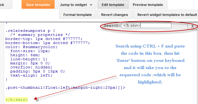
  • Then click anywhere inside the code area and search - using CTRL + F keys - for the ]]></b:skin> tag and just above ]]></b:skin> add this code:
/* Horizontal menu with 2 columns
----------------------------------------------- */
#menucol {
width:940px;
height:37px;
background-image: -moz-linear-gradient(top, #666666, #000000);
background-image: -webkit-gradient(linear, left top, left bottom, color-stop(0.00, #666666), color-stop(1.0, #000000));
filter: progid:DXImageTransform.Microsoft.Gradient(gradientType=0,startColorStr=#666666,endColorStr=#000000);
border-bottom:1px solid #666666;
border-top:1px solid #666666;
margin:0 auto;padding:0 auto;
overflow:hidden;
}
#topwrapper {
width:940px;
height:40px;
margin:0 auto;
padding:0 auto;
}
.clearit {
clear: both;
height: 0;
line-height: 0.0;
font-size: 0;
}
#top {
width:100%;
}
#top, #top ul {
padding: 0;
margin: 0;
list-style: none;
}
#top a {
border-right:1px solid #333333;
text-align:left;
display: block;
text-decoration: none;
padding:10px 12px 11px;
font:bold 14px Arial;
text-transform:none;
color:#eee;
}
#top a:hover {
background:#000000;
color:#F6F6F6;
}
#top a.submenucol {
background-image: url(https://blogger.googleusercontent.com/img/b/R29vZ2xl/AVvXsEhBljYBBaCjWzIlUkYiuQX-f4ZwxYvsXQbwgRcwMh6KMuBiechLgQWha0b57g-6CHpoA6rcOkQHlJleLR9B0-oJQVIJwXXGEzka7VXg4GUkihZDmnp8bCS5dlnMdSNTnbPXl_JE0wbXjr4/s1600/arrow_white.gif);
background-repeat: no-repeat;
padding: 10px 24px 11px 12px;
background-position: right center;
}
#top li {
float: left;
position: relative;
}
#top li {
position: static !important;
width: auto;
}
#top li ul, #top ul li {
width:300px;
}
#top ul li a {
text-align:left;
padding: 6px 15px;
font-size:13px;
font-weight:normal;
text-transform:none;
font-family:Arial, sans-serif;
border:none;
}
#top li ul {
z-index:100;
position: absolute;
display: none;
background-color:#F1F1F1;
margin-left:-80px;
padding:10px 0;
border-radius: 0px 0px 6px 6px;
box-shadow:0 2px 2px rgba(0,0,0,0.6);
filter:alpha(opacity=87);
opacity:.87;
}
#top li ul li {
width:150px;
float:left;
margin:0;
padding:0;
}
#top li:hover ul, #top li.hvr ul {
display: block;
}
#top li:hover ul a, #top li.hvr ul a {
color:#333;
background-color:transparent;
text-decoration:none;
}
#top ul a:hover {
text-decoration:underline!important;
color:#444444 !important;
}
  • Now find (CTRL + F) this line:
/* Tabs
  • It will also have some little lines beneath:
/* Tabs
----------------------------------------------- */
  • And just below these little lines, delete the code below until you reach at:
/* Columns
----------------------------------------------- */
  • Instead of the code that you have removed, add this one:
#crosscol ul {z-index: 200; padding:0 !important;}
#crosscol li:hover {position:relative;}
#crosscol ul li {padding:0 !important;}
.tabs-outer {z-index:1;}
.tabs-inner {padding: 0 0px;}
See this screenshot for more info:
menu for blogger, blogger gadgets, blogger widgets
STEP 4: The final step is to Save the Template and you are done!

Visit your blog to see a beautiful navigation menu just below header.
If you have any questions or need help, leave a comment below.

Fade In/Out Page Loading Effect On Blogger Posts

08.08 0
A very common effect in jQuery is the fade effect that hides or shows an element by fading it, and we can use it in many ways as for example in the blog's navigation. The following script does just that, by loading the page with a fading effect when we browse on internal links that are in the blog, such as post titles, labels links, archive, navigation links, etc..
jQuery effect, fade in effect, blogger jQuery
You can see an example in this demo blog, click on the title of any post and see the fading effect when the page is loading.

How To Implement the Fade In Loading Effect

1) To put this fading effect on your blog, go to your Template > Edit HTML :

fading effect, blogger blogspot, blogger tricks

2) Click anywhere inside the code area and search for the </head> tag using CTRL + F keys:


3) Then, just above </head> add the following code:
<script src='http://ajax.googleapis.com/ajax/libs/jquery/1.8.2/jquery.min.js' type='text/javascript'/>
<script type='text/javascript'>
//<![CDATA[
$(document).ready(function() {
$("body").css("z-index", "-10");
$("body").fadeIn(0);

$("a").click(function(event){
event.preventDefault();
linkLocation = this.href;
$("body").fadeOut(500, redirectPage); });
function redirectPage() {
window.location = linkLocation;
}
});
//]]>
</script>
<style>
html {
background-color: #F2F2F2; /* Color fading */
}
</style>
4) Save the changes and that's it. In green you can see where to change the color that fades on a loading page.

The original script hides the body of the page while loading, I prefer to change that property with a negative z-index to avoid problems with the search engine robots that may effect the positioning.

Problems?

Consider that such effects could increase the blog loading time, so I recommend using it only when your blog loads fast and does not have too many scripts.

If you already use another version of jQuery remove the other, leaving only this which will be readed first.

If you are using Mootools or Scriptaculous, then you have to make some modifications to the code in order to be compatible.
If you have another script with a fade effect, then it could interfere with this and you might not see anything on the page except the color fading, in such cases it is better without this script.

You can also use this effect only on some links, for example, if you want to appear only when you click on the post titles in the navigation links (older posts and newer posts), and on the top tabs, then replace this line:
$("a").click(function(event){
With this:
$(".post-title a, .blog-pager-older-link, .blog-pager-newer-link, .tabs").click(function(event){
In some cases, the page can load for a second and then load with the fade effect, this may be "normal" because the browser is slow to read the script on page load.

Apart from these drawbacks, I think it's a very elegant way to load blog pages while browsing them, don't you think?

Create Accordion Widget in Blogger

12.30 0

Accordion Widget for bloggerUpdate: The Script  has been updated and it will work just perfect!

It is really important to organize your content and make certain sections of your blog to appear only when the visitor is interested in it. We are using an Accordion Widget that you can find at the footer of our blog in order to display a list of Popular Series. Its an effective way for us to display long list of links in a neat and clean way. I created this widget using  JQuery and the Easing Plugin. This Accordion widget is a modified version of the Fresh content Accordion released by Martin Angelov in 2009. We customized its stylesheet and edit some parts of the scripts to make it compatible with blogger blogs. It has a great Expand/Collapse Feature. This widget collapses and hides all content inside it by default but when user clicks it, the content is displayed by expanding that tab section. I am sure you would love to add this Fancy Accordion widget to your BlogSpot blogs.

Read more »

Using the :before and :after Pseudo Elements on Sidebar Titles

10.56 0
This is another method of using the :after and :before properties and it will work without too many problems in any browser, including IE8. What this trick will do is to divide the header bar into left and right sections, where the left will contain an explanatory title and the right, a related link.

The idea of generating Adobe-like Arrow Headers was actually discussed by css-tricks and adapted to Blogger.

How to Add Adobe-like Headers to Blogger

blogger gadgets, blogger tricks, blogger blogspot

Step 1. Log in to your Blogger dashboard > go to Template > Edit HTML, then click anywhere inside the code area to search - using the CTRL + F keys - for the following tag:
</head>
Step 2. Just above it, copy and paste this code:
 <style>
.module h2 {
  background-color: #D5D5D5;
  border-radius: 20px 0 0 20px;
  color: #FFFFFF;
  font-family: Verdana;
  font-size: 14px;
  line-height: 32px;
  margin: 0;
  padding: 0 0 0 20px;
  text-shadow: 2px 1px 1px #222;
}

.module h2 a {
    border-left: 5px solid #ffffff;
    color: #101921;
    float: right;
    font-size: 14px;
    text-decoration: none;
    text-shadow: none;
    padding: 0 10px;
    position: relative;
   -moz-transition: padding 0.1s linear;
   -webkit-transition: padding 0.1s linear;
   -ms-transition: padding 0.1s linear;
   -o-transition: padding 0.1s linear;
}
.module h2 a:hover {
  padding: 0 32px;
}

.module h2 a:before, .module h2 a:after {
    content: &quot;&quot;;
    height: 0;
    position: absolute;
    top: 50%;
    width: 0;
}
.module h2 a:before {
    border-bottom: 8px solid transparent;
    border-right: 8px solid #ffffff;
    border-top: 8px solid transparent;
    left: -12px;
    margin-top: -8px;
}
.module h2 a:after {
    border-bottom: 6px solid transparent;
    border-top: 6px solid transparent;
    left: -6px;
    margin-top: -6px;
}

.module.blue h2 a {background-color: #A2D5EC;}
.module.blue h2 a:hover {background-color: #C5F0FF;}
.module.blue h2 a:after {border-right: 6px solid #A2D5EC;}
.module.blue h2 a:hover:after {border-right-color: #C5F0FF;}

.module.yellow h2 a {background-color: #FCE98D;}
.module.yellow h2 a:hover {background-color: #FFD700;}
.module.yellow h2 a:after {border-right: 6px solid #FCE98D;}
.module.yellow h2 a:hover:after {border-right-color: #FFD700;}

.module.green h2 a {background-color: #bada55;}
.module.green h2 a:hover {background: #C7E176;}
.module.green h2 a:after {border-right: 6px solid #bada55;}
.module.green h2 a:hover:after {border-right-color: #C7E176;}

.module.red h2 a {background-color: #F0A5B5;}
.module.red h2 a:hover {background-color: #FFC7D2;}
.module.red h2 a:after {border-right: 6px solid #F0A5B5;}
.module.red h2 a:hover:after {border-right-color: #FFC7D2;}
</style>
Step 3. Save the Template.

Screenshot:


Step 4. Now go to Layout and Add a new HTML/JavaScript Gadget with one of the codes below for each of the widget title:

Background in blue:
<div class="module blue">
<h2>Title in <a href="Link URL">Blue</a></h2>
</div>
Background in yellow:
<div class="module yellow">
<h2>Title in <a href="Link URL">Yellow</a></h2>
</div>
Background in green:
<div class="module green">
<h2>Title in <a href="Link URL">Green</a></h2>
</div>
Background in red:
<div class="module red">
<h2>Title in <a href="Link URL">Red</a></h2>
</div>

Note: Change "Title in" text with your widget's title and Blue, Yellow, Green and Red with the text on the right, then add a Link URL to it.
Step 5. After you saved the HTML/Javascript gadgets containing the codes above, drag and drop them just above the widgets you want to show... and Save the Arrangement.
blogger tricks, blogger tutorials

DEMO

You can see how the sidebar titles has been replaced with some cool header bars on this demo blog.

Multi Hover Effect On Blogger Images Using Pure CSS

13.52 0
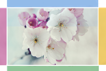
Today I'm going to show you how to add an amazing mouseover effect for Blogger images using only CSS, in which moving your mouse over an image from different directions (from above, from below, etc) will cause an overlay transitioned in from the same vector. This trick will change not only the images appearance when moving mouse over them, but will also allow you to add inside a text with a description.

hover effect, mouseover, blogger hover effects

You can see the effect on this image below: try moving your mouse from the left, right, and above.

hover right hover top hover left hover bottom

Adding Hover Effect From Different Directions on Blogger Images

First thing to do is to add the CSS style to our Template:

Step 1. From Blogger Dashboard, go to Template and press the Edit HTML button


Step 2. Search for the </head> tag - to find it, click anywhere inside the code area, press CTRL + F keys and type it in the search box.


Step 3. After you found it, add the following style just above it: 
<style>
  /* The container and the image */
  div.multi-hover {
    overflow: hidden;
    position: relative;
    vertical-align: middle;
    width: 100%;
    height: 358px;
    line-height: 358px;
  }
  div.multi-hover img {width: 100%;}

/* The texts that, by default, are hidden */
  div.multi-hover span {
    color: #FFF;
    font-size: 32px;
    font-weight: bold;
    height: 100%;
    opacity: 0;
    position: absolute;
    text-align: center;
    transition: all 0.3s linear 0s;
    width: 100%;
  }

/* And this is what will generate the effect */
  div.multi-hover span:nth-child(1) { /* right */
    background: none repeat scroll 0 0 rgba(255, 189, 36, 0.6);
    left: 90%;
    top: 0;
  }
  div.multi-hover span:nth-child(2) { /* top */
    background: none repeat scroll 0 0 rgba(106, 170, 255, 0.6);
    left: 0;
    top: -80%;
  }
  div.multi-hover span:nth-child(3) { /* left */
    background: none repeat scroll 0 0 rgba(204, 87, 166, 0.6);
    left: -90%;
    top: 0;
  }
  div.multi-hover span:nth-child(4) { /* bottom */
    background: none repeat scroll 0 0  rgba(97, 181, 115, 0.6);
    left: 0;
    top: 80%;
  }

  div.multi-hover span:hover {opacity: 1;}
  div.multi-hover span:nth-child(2n+1):hover {left: 0;}
  div.multi-hover span:nth-child(2n):hover {top: 0;}

</style>
Step 4. Save the Template

Now we are going to add the HTML that is nothing but a DIV where we included four SPAN tags with texts and an image:

Step 5. Choose Posts, create a New Post, click on the HTML tab (1) and paste this code inside the empty box:
<div class=multi-hover>
  <span>hover right</span>
  <span>hover top</span>
  <span>hover left</span>
  <span>hover bottom</span>
  <img src="https://blogger.googleusercontent.com/img/b/R29vZ2xl/AVvXsEjxxJqInV9GqcovPAdOk1YRYEWufhJFzlqyUxTO1X_P78amuc5jvMA0X-_8-6N_pS1ByNz3xLptYnbyZa0eqkFAIW_4KK2xRIvaCcehwfJAplWKddRimJAy37IDzLKQpJIqFp2QYvxe4Xc/s1600/flowers">
</div>
Add your own text/description to "hover right", "hover top", "hover left" and "hover bottom" (2) and replace the url in blue with the image URL (3) where you want to apply the effect.
Important! Do not click on the Compose tab, otherwise the changes will be lost.


Step 6. After you finished editing your post, click Publish (4)

And that's it... enjoy! :)

Popular Posts With Automatic Numbering - Bubbles!

12.27 0

Popular Posts Widget

When blogger released Popular Posts widget back in 2011, we leaked out its stylesheet so that you can customize it to blend it perfectly to your BlogSpot templates. Today we will learn how to display the list of popular posts using CSS3 auto increment property. You can style the numbers in variety of shapes, we styled them in square/rectangular and circular shape. you guys were the first to display threaded comments with Comment Counts and today you will again learn something more interesting. You can see a practical demo of this implementation on our sidebar. Lets add this effect to blogger in fairly easy steps using pure styles with no use of JavaScript.

Read more »

Design a Responsive Blogger Template - Tutorial

12.25 0

Design Responsive Blogger TemplateDesigning Mobile Responsive Templates has become a trending topic in web today. Mobile Technology and Mobile Traffic has evolved immensely from 2010 to 2013 especially in Asia USA and Africa. People now prefer reading emails on their iPhone as compared to using their Desktop computer. Fast wireless wifi connections is another reason that encouraged usage of mobile devices like smart phones (Apple and Android), Tablets, netbooks and low resolution cellphones like NOKIA.

More of our clients today are interested in fluid and flexible Blogger templates compared to traditional Fixed width Layouts. We have received over a hundred requests for this tutorial series. We are therefore releasing the first ever complete step by step Tutorial Guide on Mobile Optimized Responsive Blogger Templates to the Google Blogger Community. You will learn how to enable your Blog layout adjust itself automatically to the Device Screen Size.

Read more »

Drawbacks of JQuery Lazy Load Plugin For Posts and Images

12.29 0

Lazy Load For blogger blogsJquery and CSS3 has enabled front end developers and even designers to create amazing effects but unless you check the compatibility of the code, never play with such plugins and tools because there are still people who don't use JavaScript in their browsers and your blog will look no less than a mess to them. This effects both your readership and blog pageviews. We are observing a growing trend of Jquery implementation on both Blogger and Wordpress blogs. A Famous known plugin is Lazy Load for images (inspired from Yahoo plugin) and Lazy Load for blogger posts (Also called infinite scrolling). Lazy load for images delays loading of images in long web pages and makes the page load faster, on the other hand Infinite Scrolling plugin for Blogger keeps on loading posts as you scroll down the page just like you scroll down to load more tweets in twitter.
Read more »

How To Add Social Media Icons to Blogger Header

16.22 0
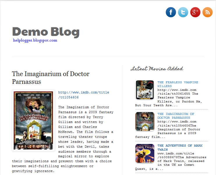
social media icons, facebook icons, social media icons for bloggerThis tutorial will help you to add social media icons in the top right corner of the page which could increases the likelihood that readers can follow through the various social networks. There are several ways to do this, like adding a new widget section to the blog header but now, we'll do it using an unordered list that uses icons of Facebook, Twitter, Google+ and blog feed, and as a bonus, the icons will rotate when you hover over them.

You can see a demo in this test blog.


Adding Social Media Icons to Blogger Header

Step 1. From your Blogger dashboard, go to Template and click on the Edit HTML button:

blogger blogspot, blogger template, blogger gadgets

Step 2. To expand the style, click on the small arrow on the left of <b:skin>...</b:skin> (screenshot 1), then click anywhere inside the code area to search (using CTRL + F) for the ]]></b:skin> tag (screenshot 2) and add this code just above it:

 /* Social icons for Blogger
----------------------------------------------- */

#social-icons {
margin-bottom:-30px;
height:50px;
width:100%;
clear:both;
z-index: 2;
position: relative;
}
.social-media-icons {
display:table
}
.social-media-icons ul {
text-align:right;
padding:5px 5px 0 0
list-style-image:none;
list-style-position:outside;
list-style-type:none;
}
.social-media-icons ul {
margin-bottom:0;
padding:0;
float:right;
}
.social-media-icons li.media_icon {
margin-left:6px;
padding-left:0 !important;
background:none !important;
display:inline;
float:left;
}
.social-media-icons li:hover {
-moz-transform: rotate(360deg);
-webkit-transform: rotate(360deg);
-o-transform: rotate(360deg);
transform: rotate(-360deg);
-moz-transition: all 0.5s ease-in-out;
-webkit-transition: all 0.5s ease-in-out;
-o-transition: all 0.5s ease-in-out;
-ms-transition: all 0.5s ease-in-out;
transition: all 0.5s ease-in-out;
}

Screenshot 1:


Screenshot 2:


Step 3. Now search for this line

<b:section class='header' id='header' maxwidgets='1' showaddelement='no'>

Step 4. And just above it, add this code:

<div class='social-media-icons' id='social-icons'>
<ul>

<li class='media_icon'><a href='http://facebook.com/username'><img border='0' src='https://blogger.googleusercontent.com/img/b/R29vZ2xl/AVvXsEg8z1mG55HTkVxDV-I-Fbw-arVvie9089tx4LWPTAvbc7lBEe2CIgrzj3RBBOkL50Nx3P-_mohmC4Vxt_JSRwGvpSFyC4YciTeXpnA8jff2tChWJ1PptWd5twSeqzes69ZEqwn0T53peUk/s1600/Facebook.png'/></a></li>

<li class='media_icon'><a href='http://twitter.com/#!/username'><img border='0' src='https://blogger.googleusercontent.com/img/b/R29vZ2xl/AVvXsEhFeu_q87uBmroory0vuoA-1NH6FaUgSkvJ2_Yl7JQtKdKNMmN-G8UPl0F_g51MIdIX8QOcwfp4u6jH6rXAe32UlWbni9rHYKNgm2ynvJnw4XZuVIFIloAo_E0lsp5DeP9BgRcteYl0o6c/s1600/Twitter.png'/></a></li>

<li class='media_icon'><a href='https://plus.google.com/XXXXXXXXXXXXXXXXXX/about'><img border='0' src='https://blogger.googleusercontent.com/img/b/R29vZ2xl/AVvXsEhw78LmIjHzUtPELzmixOuRPmeCMk7yjGBjCbMD7JfD6Gs6ozD-fws78J3aTslX6WPJlg9ypNQ1PCAXkqqemfpHTnaaHrHlUPqB8G0Szjb345ljqrXKbQENhdXBY_gBSRQB7Q66C87qSpw/s1600/googleplus.png'/></a></li>

<li class='media_icon'><a href='http://name-of-your-blog.com/feeds/posts/default'><img border='0' src='https://blogger.googleusercontent.com/img/b/R29vZ2xl/AVvXsEhaqH9Lhrk9Cq00vsL3veI8Wrsu08zxffC5VWPPDeWdn7gqfmETKpe5w-8zvVaNPy7Dfl3D94kxUm0w9U7MtxPDxkSBH59089o04uB-jhCNHtMd5iaJ8U5tivz0zPfNFJm6go_dZZ62t5s/s1600/RSS.png'/></a></li>

</ul></div>

Customization

- Change what's in red with your usernames and id: the first is your Facebook username, the second is that of Twitter, in the third you should change the X by the ID of your Google+ profile and in the fourth you will put the name of your blog.
- To change the icons, just replace the urls in blue with the ones of your images.
- You can add more icons if you want, you just have to add before </ul></div> a line like this for each extra icon you want:

<li class='media_icon'><a href='Link URL'><img border='0' src='Image URL'/></a></li>

Step 5. Finally, Save the Template to apply the changes.
The effect is done with CSS3, so this effect will not work in older browsers.

Create a Custom Contact Form For Blogger - Part 2

11.37 0

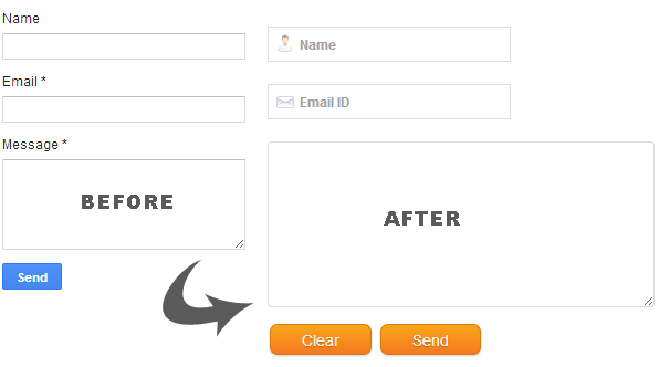
Custom Blogger Contact FormIn the first part of our series you learnt how to add a contact Form to your BlogSpot blog and control its display settings. Today you will learn how to change its stylesheet to reflect your custom styles with a more appealing design. You will learn today how to customize the Form input fields, add icons to it, add a "Clear Button"  and play several tricks with your custom form. The form is built using XHTML Get or Post Methods unlike PHP Forms which are used widely today. If you have not referenced the first part of our tutorial then kindly read it first:

Read more »